Expanding your political coverage on your Web site doesn’t have to put a huge strain on your newsroom. If you’re looking for ideas to try online or places to find good information, look no farther. During the 2008 campaign, we put together a list of resources, including a number of free widgets, many of which are still available. No need to reinvent the wheel, right?
Candidate fundraising: A customizable Flash widget from MapLight.org creates a graph from FEC data on fundraising by candidates that you can embed in your page. You control which candidates to include, what order to put them in, and the colors to use.
The Center for Responsive Politics has tracked candidate fundraising for a decade now. Check their site, OpenSecrets.org, for data on congressional candidates as well as presidential. Search for your boss, neighbors, relatives, friends, and favorite celebrities.
The Huffington Post developed a bunch of political fundraising widgets from public records filed with the FEC. One version of a widget from Fundrace 2008 lets users search for contributors by name or location.
Need to fact check campaign videos or candidate statements? Start at factcheck.org, a project of the Annenberg Public Policy Center of the University of Pennsylvania, run by former CNN and Wall Street Journal reporter Brooks Jackson.
Then check the the “truth-o-meter” from Congressional Quarterly and the St. Petersburg Times, that rates political statements, attacks and ads from “true” to “pants on fire.” A widget makes it easy to add the meters to your own site.
Finally, the Washington Post’s Michael Dobbs had a “Fact Checker” blog whose goal was to “‘truth squad’ the national political debate.” Check the archive for inspiration if you’d like to try something similar on a local campaign.

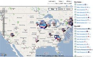
Want to know where the candidates are spending the most time? Check the interactive travel map Slate created at http://www.mapthecandidates.com/ You could do something similar for state candidates alone using Google Maps. If you’re already keeping track of candidate schedules at your assignment desk, it wouldn’t take much effort to map that information. Besides, it’s free.
Issue coverage tracker: From the Washington Post, a Flash widget showed the connection between candidates and issues based on mentions by news organizations, political parties, interest groups, bloggers, unions, trade organizations, candidates, activists, and more. Just click on a candidate and a tag cloud shows the issues most closely associated with that candidate in all of the coverage tracked. Click on the tag, and a pop-up window shows recent coverage of the candidate’s views on that issue. A slider at the bottom of the page allows users to set a date range for the coverage they want to see. Very cool.
For more about candidates’ positions on the issues, check the non-partisan site OntheIssues.org or Project Vote Smart, which is now allowing its data to be posted on other sites. You need some programming knowledge, however. Read their how-to page here.
Candidate bobbleheads: A fun, interactive widget produced by SpringWidgets, part of Fox Interactive Media. They had a long list of candidates to choose from during the campaign.
MySpace friends: TechPresident tracked each candidate’s “friends” totals on MySpace. Their widget turns those statistics into a badge you can embed in your page template. Crawdad Technologies has created Wonkosphere to monitor “political buzz” online. Their widget (left) shows the proportion of buzz for the top five candidates in all blogs for the 24 hours preceding the latest update.
It’s fascinating to see how political rhetoric has changed over time. Scroll through these presidential speech tag clouds created by Chirag Meta, a 26-year-old IT manager from Florida. The slider at the top of the cloud lets you go back and forth in time, so you can see at a glance which topics were getting the most attention when. The image below is from President Bush’s 2007 State of the Union speech. Consider using the free code to create your own tagged timeline for state or local officials. Or just plug a speech into Wordle to generate a static word cloud.

Issue grids: “One Vote Under God” was a matrix produced by Northwestern’s Medill School of Journalism to help voters visualize the role of faith in the campaign. It could be a model for illustrating a statewide or local issue:

Want to let your audience see how their views match up with those of the candidates? Consider building a version of the USAToday Candidate Match Game.

In 2008, you could can see how two candidates compared with each other on the issues at WMUR or SelectSmart, or “rate” the candidates on the MSNBC matrix.
And here’s one more idea you can try at home. This video issues guide in grid form was created by a voter, using clips from YouTube. If he can do it, you can too. 


