 For sheer emotional impact, nothing rivaled the pictures. Few people who were anywhere near a television set a year ago this month will ever forget the sight of a commercial jet slamming into the World Trade Center, live. Television has the power to take viewers where they cannot go, telling stories with pictures and sound that viewers can feel, understand and remember. But in too many television newsrooms these days, especially at the cable networks, that power has been deliberately crowded out.
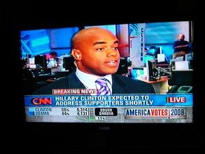
It would be wrong to blame September 11 alone for the crawls and tickers that have swallowed our television screens. The truth is the revolution really started last summer when CNN debuted its revamped Headline News format. What had been the network’s primary visuals–anchors, reporters and video–were squeezed into the upper right hand corner of the screen to make room for layer upon layer of text and graphic information.
CNN’s motive was simple: to draw desirable younger viewers known to the network as “time warriors,” who are believed to want more information more quickly. To generate what it calls “real news, real fast,” the network appointed a “data wrangler” to whip out fact boxes and graphics around the clock. The executive in charge of launching the new Headline News image, Mary Lynn Ryan, said in April that the redesign was based mainly on gut feelings and staff suggestions. “Believe it or not,” she said at a Radio-Television News Directors Association panel discussion, “no real audience research was done.”
Actually, that’s not hard to believe at all. Researchers say the Headline News format looks as if it were designed to make it harder for viewers to understand the main content of the news programs. “Viewers are comfortable with crowding,” says Paul Traudt of the University of Nevada, Las Vegas, “if the elements are all related to the same topic.” But Headline News has “multiple, incongruent elements” like weather conditions, a stock ticker, sports scores and headlines unrelated to the main topic. Says Traudt, “The result can be information overload.”
That’s not merely theory. A new study at Kansas State University has found that the visual elements of the Headline News format take an enormous amount of effort to process. “The results are clearer than anything I’ve ever done before,” says K-State journalism professor Tom Grimes. Further research will test the obvious implication: that viewers who watch a heavily cluttered news program aren’t likely to understand or remember much of what they see or hear.
But that may not matter to Headline News and its cable cousins. Their top priority, it seems, is not to educate and inform but to draw eyeballs. And what they’re doing may work. “Anything that moves is most powerful,” Traudt says. “It grabs attention and overpowers everything else.”
In fact, the whole point may be to keep viewers wondering what they just missed so they’ll stay tuned rather than clicking away. “We try to be edgy,” Ryan says, “so people will go, ‘Huh? What’s that?'”
Viewers who are distracted or confused by what they’re watching aren’t likely to recall the details of the message being presented. That truth has not been lost on the people who write the checks that keep the news channels in business. Surely you’ve noticed that the tickers go away when the commercials come on.
In their desperation to attract viewers, the all-news channels have become blind to the unique power of the television medium to convey information and emotion with pictures. Television news should be all about telling stories. Pictures make news stories more realistic, researchers say, helping viewers to form more complete and accurate impressions of people and events. But the cable newscasts make no effort to present compelling stories. Instead, they’re engaged in a high-speed data dump.
Ryan, now managing editor at CNN, believes the Headline News format is user friendly, but she concedes, “We’ve had to adjust viewers’ ways of looking at the screen.” The channel has made some adjustments too. On its first anniversary, it dropped the confusing weather maps, and put scores and stock updates in a highlighted box. But the Headline News screen still mimics a newspaper, with the important information placed “above the fold.” The trouble is, you can’t fold your television set.
So here’s a simple suggestion: duct tape. Roll it out, stick it on, and cover up the lower part of the screen. Works like a charm. The only downside is that it makes you realize just how unwatchable the rest of the product really is.
This article was originally published by American Journalism Review, September 2002.


