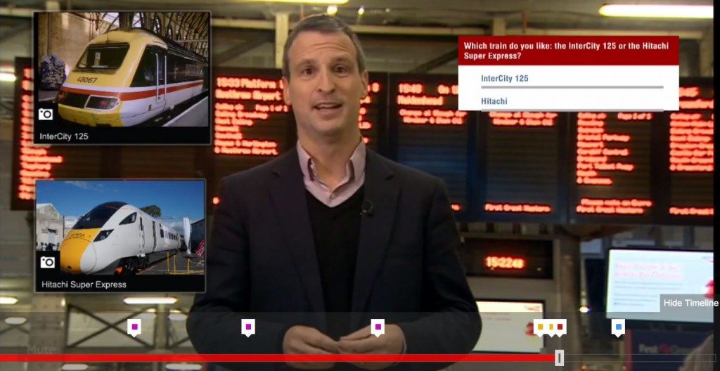
 In the early days of online video, interactivity looked something like this: A person on camera would point above, below or to the side of the video frame and suggest that the viewer might want to “click the link” to learn more about whatever they were watching. Awkward? You bet it was.
Now there’s TouchCast, which allows producers to embed images, files and even video within a video. If the user clicks on an embedded file, the main video pauses and shrinks back into a corner. Playback resumes with a click on the minimized video frame.
The BBC has been experimenting with what it calls this “new way of watching video” for news and other programming. Topics have included everything from high-speed rail to living with dementia.
Ireland’s RTE posted an interactive as a guide to its investigation of political expenses.
The Wall Street Journal also has experimented with TouchCast, although reporter Sara Murray has since moved on to CNN and their interactive video effort appears to be on ice.
TouchCast was co-founded by former TechCrunch editor Erick Schonfeld, who talked to BeetTV about the platform. The company offers both a desktop (PC) version and a free iPad app.
If you watch enough of these videos, it’s pretty clear why they’re called experiments. Every presenter has his or her own way of working with the embedded files. Some seem perfectly comfortable just referencing their availability and moving on. Others appear to be in retro mode, taking pains to tell viewers how to point and click while pointing themselves–not much better than the early days. The BBC dementia story takes a different approach with no on-screen anchor. Instead, full screen graphics offer viewers a choice to click or wait for what comes next.
Is it perfect? Of course not. Is it made for daily news? I doubt it. But it’s an interesting option for newsrooms to consider for special projects.


1 Comment
I’m concerned that viewers might click on something which takes them away, where they might go from one subject to the next never to return to the video. I do like the interactive graphics, and the option for the presenter to move it around but the presenter shouldnt ‘lose’ control of the viewer. I would suggest touchcast without the click through or else with a time limited click through which automatically returns to the presenter a few seconds later