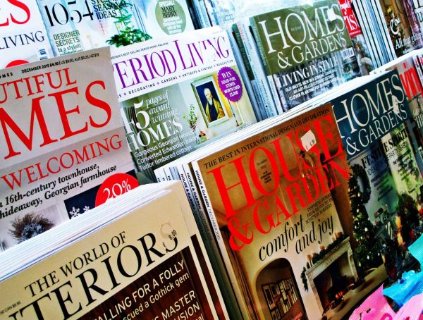
Over the years, magazines generally have used similar designs and layouts, aiming for the largest readership possible. Newell Turner, editorial director at Hearst Design Group, understands the traditions but also wants to see more experimentation with design elements as well as greater focus on a more specific audience.
“My concern today is that when I look at all of the magazines that have been around, that have good businesses, large-scale, they all look the same,” he said recently. “They’re all in sort of this same design box. They’re more or less the same size. Architecturally, they’re sort of designed the same way.”
Turner believes it is important to experiment with design without eliminating every traditional aspect of a magazine. For example, he explains that magazines can play with paper cover, stock, the architecture and the overall pacing of the magazine itself. Changing up these elements will allow a magazine to stand out from the numerous mundane magazines with the same overall design and layout that line the shelves of stores worldwide.
“Indie magazines are doing beautiful things. From a creative standpoint, they’re doing some of the most exciting things,” says Turner, who draws much of his own inspiration from this particular magazine style.
One trend that he thinks is catching on is creating magazines that are more like books. Turner recently came across an issue of Creative Quarterly magazine, which he cited as an example of the “book” effort. While magazines like Creative Quarterly do have advertisements, they incorporate them into the actual stories rather than in a “set” ad section.
“It basically was a magazine that didn’t look like it had ads. And you know, that’s a very unique situation, and not everybody can afford to have only a few ads and go that far with it, but it was interesting to me to see. It really opened my eyes to the opportunities with some native content,” says Turner. “When it’s right, it really enhances the magazine and doesn’t take away from it.”
Another trend that Turner thinks is very prominent in the industry today is having more specific target audiences.
Previously, magazine success what measure readership size — the more readers, the more successful the magazine. However, wide readership means the audience is so diverse that advertisers do not know exactly which audience they are reaching.
“We’re going through a real re-evaluation of the metrics of success in magazine publishing, and I think that for the longest time, bigger, meaning larger, more readers, was a real metric of success,” says Turner. “I think the future is more focused demographics, so smaller circulations.”
With a more defined demographic, magazines find it easier to sell space.
“When you have to appeal to everybody, you can’t do much of anything. But when you have a really tightly defined audience, you can just do deep dives into subjects that are the passion points,” Turner says.
Though the circulation numbers may not be as high, having a more focused audience allows magazines to get more creative with content and design. The reason: The magazine knows what its readers want.
In that situation, Turner adds, “It’s a lot more fun.”


