By Deborah Potter and Tom Grimes
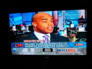
 Watch television news these days, especially on cable, and you’re likely to see more words than pictures. The graphic look pioneered by CNN Headline News years ago is now widely imitated. Jerry Seinfeld, for one, doesn’t like it. “Don’t these idiots who run the news networks understand?” he asks in his stand-up comedy routine. “I don’t want to read. That’s why I’m watching TV.”
Graphic overload isn’t just irritating, it’s also counterproductive. According to a new study, viewers who get their news in a graphic-heavy format wind up less informed than viewers who see the same news without all the graphic boxes, news headlines, sports scores, and weather reports.
To study the effect of the graphic-heavy format, NewsLab created newscasts featuring different versions of four stories. Version one was the CNN Headline News format as it appears on the air. In this version, the anchor and the video stories appeared on the upper right side of the screen, with a graphic box on the left side displaying facts related to the story, and another graphic layer at the bottom displaying unrelated information that changed every few seconds. Version two was electronically manipulated to remove all of those graphic layers, creating a full-screen of the anchor box. The stories were in different orders to control for any order effect. The stories were: the kidnapping of a Virginia girl; a report on an Al Qaeda terrorist training camp; a critique of New York City’s emergency response to 9/11; and the murders of Louisiana State University students.
Researchers at Kansas State University had undergraduates screen the newscasts. Half of them watched a newscast in the original CNN format, and half watched the manipulated “no graphics” version. Afterwards, the students answered 40 written questions to see how well they understood the basic facts and themes of each story.
The researchers ran the experiment twice, giving the two groups of participants different instructions. Both groups were told to expect a written comprehension test after the screening. But the first group was told to concentrate on the anchor portion of the newscast. The second group was just instructed to watch the program.
The results showed that participants who watched the original format remembered significantly fewer facts about the stories than participants who watched the manipulated version that eliminated the layers of graphics. This held true even when the participants were specifically told what to focus on.
Although the results were statistically significant, the researchers note that all participants in the experiment got more than half the questions right. Clogging the screen with graphics does not make it impossible for viewers to understand most of what they’re watching. But the study clearly shows that a newscast in which stories are surrounded by unrelated, changing graphics is harder to understand.
These results should be of great interest in television newsrooms because they indicate that newscast format affects how viewers understand the news. While this research tested only one specific format used by CNN Headline News, it has broad implications for television news in general. Other cable networks and many local stations have adopted similar practices, using headline tickers and text-filled graphics in their newscasts.
A cynic might suggest that newsrooms don’t much care whether viewers understand or remember what they see on the air, that what really matters is how many viewers tune in. Indeed, one could argue that the Headline News format—fast-paced and full of on-screen movement—is designed to draw “eyeballs” to the screen, because that’s what really counts. But journalists themselves say their primary purpose is to inform, and if viewers can’t understand the news they see on the air, then television journalists are failing to accomplish that purpose. This research sends a clear message: To make your newscasts easier to understand, go easy on the trappings.


