 Television newscasts these days are replete with graphics, in part because new, inexpensive technologies have made it relatively easy for even the smallest newsrooms to produce them. There has been little research, however, to determine the effectiveness of different types of graphics in helping viewers understand and remember what they see on the air. A study by researchers at Indiana University in collaboration with NewsLab found that graphics can make a significant difference in how viewers process television news, but not for all stories. Perhaps most surprisingly, not all of the difference is positive.
Working with Knight Ridder Tribune’s News in Motion, a company that produces animated graphics for television news subscribers, NewsLab created three different versions of seven stories. The original versions, produced by local stations and provided by News in Motion, used an animated graphic to illustrate a segment of the story.
For example, in a report on how to build a “tornado resistant” house, the animation shows the effects of a tornado’s winds on a regular house and a specially-constructed house.
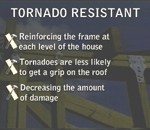
 NewsLab then created a second version of each story by replacing animated graphic sections with full-screen text graphics matching the audio track. The full-screen graphics in this version are bullet lists of the different effects of a tornado on a conventional house as opposed to a tornado-resistant house.
 We also created a third version, replacing the graphic section entirely with B-roll video. The all-video version covers the graphic section of the “tornado resistant house” story using shots of tornado damage, including aerials and ground-level video.
The Institute for Communication Research at Indiana tested the stories by showing them to college students and adults ranging in age from 28 to 80. All subjects saw two stories using B-roll, two using text graphics and two using animated graphics. The specific stories and the order in which they were shown varied.
The researchers found that viewers who saw a version with graphics, whether animated or full screen, had an easier time processing the information in the stories than viewers who saw a version illustrated only with B-roll. But there was a key difference between the two different types of graphics. Full screen graphics did not hold viewers’ attention. In fact, attention as indicated by heart rate dropped off steadily the longer the text graphic stayed on the screen, but stories using animated graphics held viewers’ attention just as well as the B-roll versions.
In addition, the research found a significant difference between the effect of graphics in stories that the subjects rated as easy to understand and those that were considered more difficult. Viewers who saw difficult stories using animated graphics understood and remembered those stories significantly better than those who saw the same stories with text graphics. Difficult stories using text graphics were remembered better than stories with B-roll. In easy stories, graphics had virtually no effect on what younger viewers remembered, but the animated graphics did help older viewers recall what they’d seen.
For news producers, this study suggests that animated graphics offer a way to keep viewers watching and to help them remember stories better. In other words, animated graphics can help build ratings and better inform viewers. But the study raises a caution flag about the use of text graphics. While they can help viewers remember important information in difficult stories, they’re no good at holding viewers’ attention, so the gain may not be worth the risk of losing the audience.
References:
1.Julia Fox is assistant professor of telecommunications at Indiana University. Her research interests are in media processes and effects.
2. This report is adapted from a paper presented at the Association for Education in Journalism and Mass Communication annual conference in Miami, Florida, August 2002.


