Data is everywhere. The key is knowing how to interpret it, and that can take time and determination. More news organizations are hiring people whose specialty is finding, analyzing and visualizing good data stories.
So where to begin?
Start with a reliable data set, says Max Freund, managing editor of digital at The Gazette in Cedar Rapids, Iowa, and an adjunct professor in the School of Journalism and Mass Communication at the University of Iowa.
“What I think is important for people to keep in mind if they’re wanting to get into true data journalism and data analysis is to not get caught up in what the trendy tool or the trendy programming language is and really learn foundations first,” he suggests. “Understand the right way to analyze data regardless of whether you’re doing it in JavaScript or Python or some other programming language. The foundations and concepts remain the same. So, what I would say the first thing to start with is look for publicly available data sets that span a long amount of time.”
Creating context
He says government agencies typically are good sources of readily available and reliable, or “clean,” data—data you can use with confidence. The challenge is finding enough years to create context. Freund says those public agencies rarely keep information longer than legally required.
“You’re not often times going to get handed 20 years of perfectly clean, consistently named data sets,” he says. “You’re going to have to build some of that yourself and hunt things down, but one year of data—there’s no context there. You need that range; you need that history to start asking questions of your data.”
Once a large enough data set is assembled, Freund says, reporters need to “interrogate” the data, and that’s what he teaches his students. “So that’s basically thinking of your data set as a source and saying, ‘OK, you’ve got all these numbers hidden in here but inside those numbers are trends, and inside those numbers are spikes or valleys or moments not in line with what you’d expect,” Freund says.
It’s tough to find those patterns in spreadsheets with hundreds of thousands of data points unless you have the right tools. Freund suggests starting with an Excel spreadsheet, which can make that massive data much more digestible by sorting it, summing it or grouping it.
“From there you can talk to people about the trends you’re finding. You can go to a source for an interview and say, ‘according to this data’ and have pointed questions that they’re forced to speak to and can’t avoid,” Freund says.
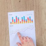
The next step is to employ tools that create visuals out of all that data. Freund has his class use Google Fusion because it’s effective and free. It’s a suite of charting tools that includes a line graph, bar graph, pie chart, stair step area chart and map that run off a standard csv or standard spreadsheet.
“You can upload your data and build your chart and you get a nice embeddable Iframe chart, map, graph—you name it—to put in your story. It’s free and it’s pretty well documented and it takes very little development ability to get that off the ground. And frankly, those charts are good enough for a lot of what you would want to do as far as relatively simple data visualizations in interactive spaces.”
Start simple, keep learning
Freund has three key pieces of advice:
- Don’t think of data visualizations as an end product. Rather, visualize your data early and often to strengthen your reporting process. Looking at a visualization of your data can prompt you to ask pertinent questions that ultimately shape your reporting.
- At the start, be OK with free tools. Free and quick is often sufficient, especially under deadline pressure.
- As you advance, look to diversify your skill set. Learn how to program so you can layer your data. The more complex your layering, the harder it is to find that ready tool to analyze those harder questions. Being able to program allows you to create the tools you need.
Freund says it’s hard to find a story that isn’t improved by contextual data that helps showcase a trend or an issue.
However, he cautions, “While data doesn’t lie, people lie about data. The way people interpret data can always skew the meanings or resulting takeaways. So, while a reporter can always benefit from becoming skilled at data interrogation, they must be equally strong in their reporting and writing in order to cut through potential spin or misinterpretation of that data.”
So, hunt down that clean data. Dig in with those computing tools. But remember: The key to success in data-driven journalism still rests on the foundation of good, solid, ethical reporting.
 Deborah Caro Goldman has worked as a writer-producer at WTTG in Washington, D.C., and as a news producer at WSOC-TV in Charlotte, North Carolina, and at WTEN in Albany, New York. She was an anchor, reporter and producer at WAGM in Presque Isle, Maine. A 1990 graduate of Syracuse University, she has degrees in policy studies and broadcast journalism and graduated summa cum laude and Phi Beta Kappa. She has a master’s degree from the Medill School of Journalism, finishing her program in Washington, D.C., as a correspondent for WDAY in Fargo, North Dakota. Contact her at debgoldman@msn.com.


